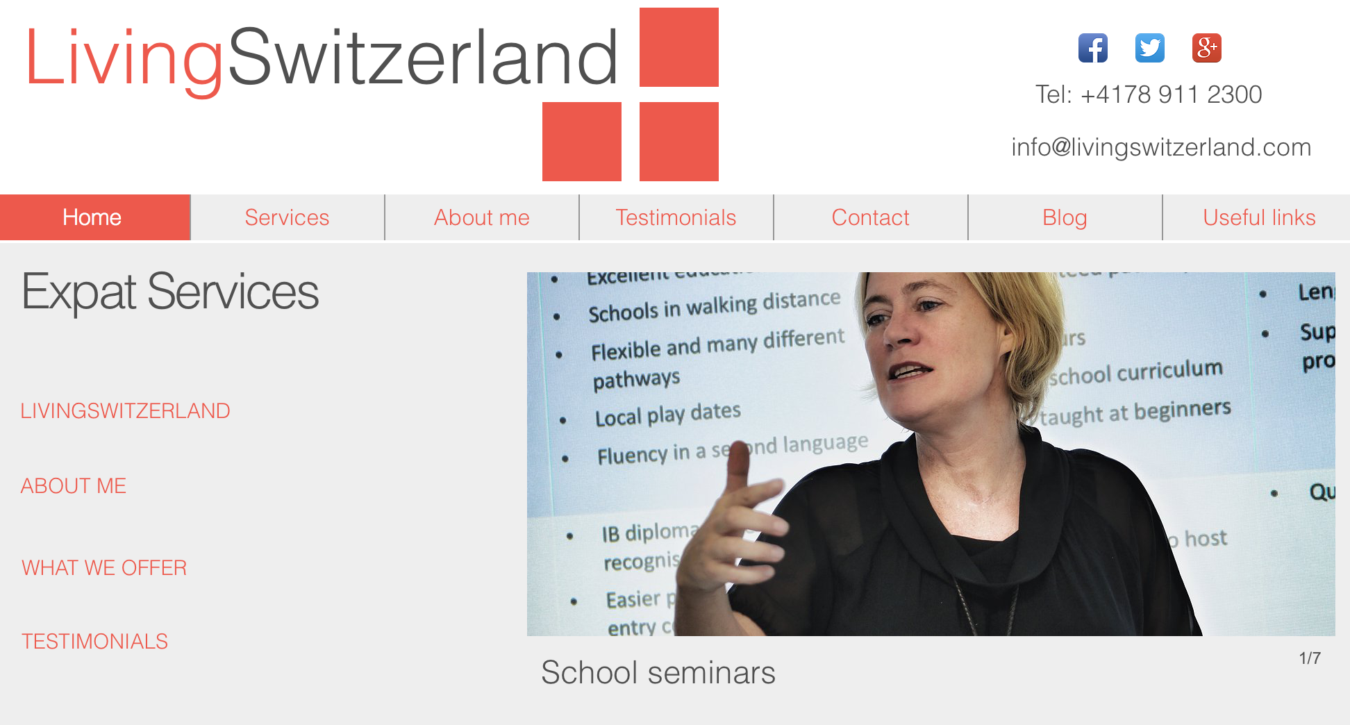


Client: http://www.livingswitzerland.ch
I’ve done a few recent shoots where my clients wanted to revamp the look of their publicity tools such as websites. They were all fun shoots and in the process or by osmosis I was able to ‘soak up’ the work they do. That was vital in order to deliver exactly what they wanted. Yes, part of the process – apart from shooting the images themselves – was understanding their business and seeing what images best suit the pages, leaflets, brochures etc. Effectively, deliver the clients’ objectives.
Photography, in particular commercial photography is not just about gloss and the wow factor, but about getting the right image (tone, feel, look, message) across to the right audience.

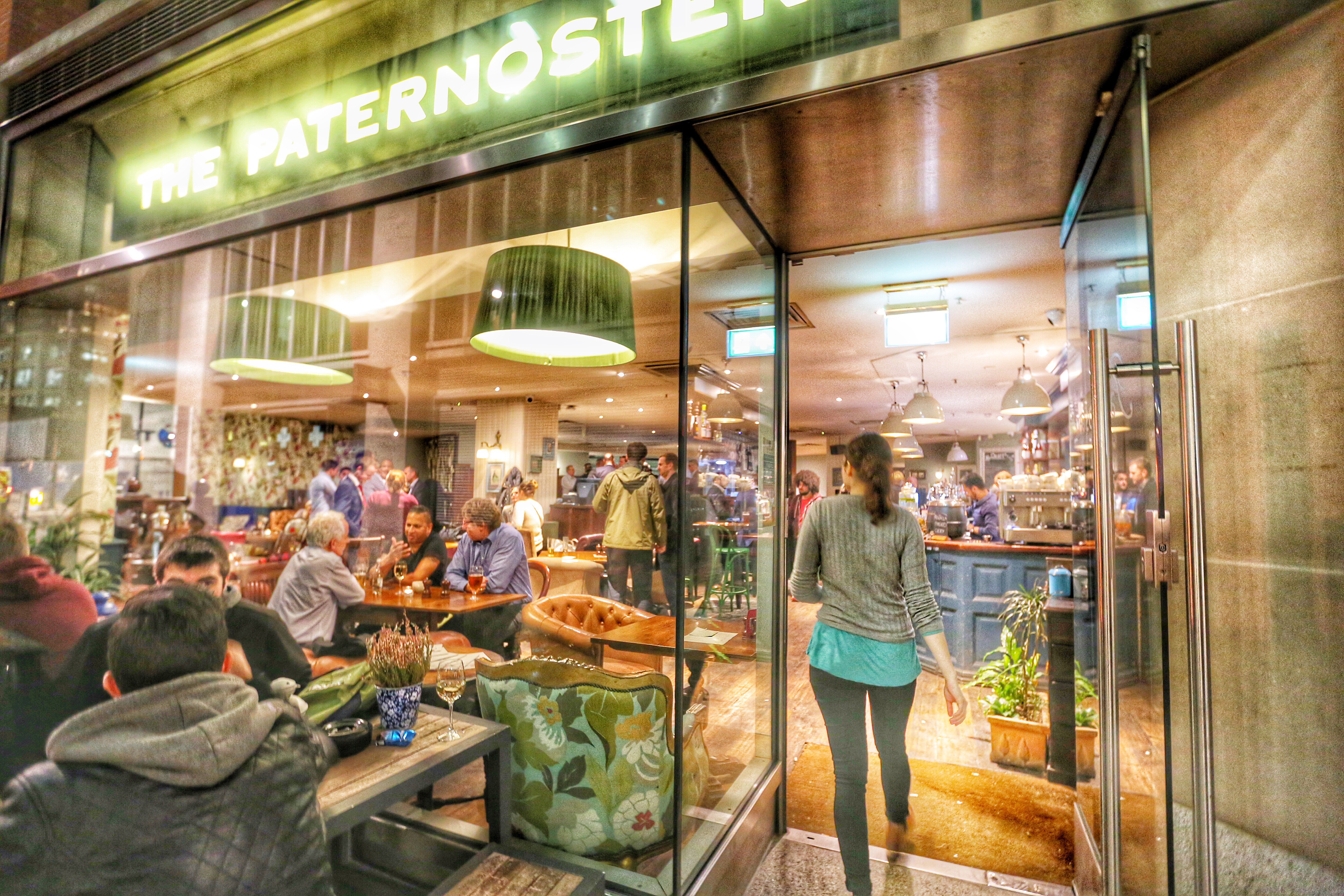
http://www.thepaternoster.com


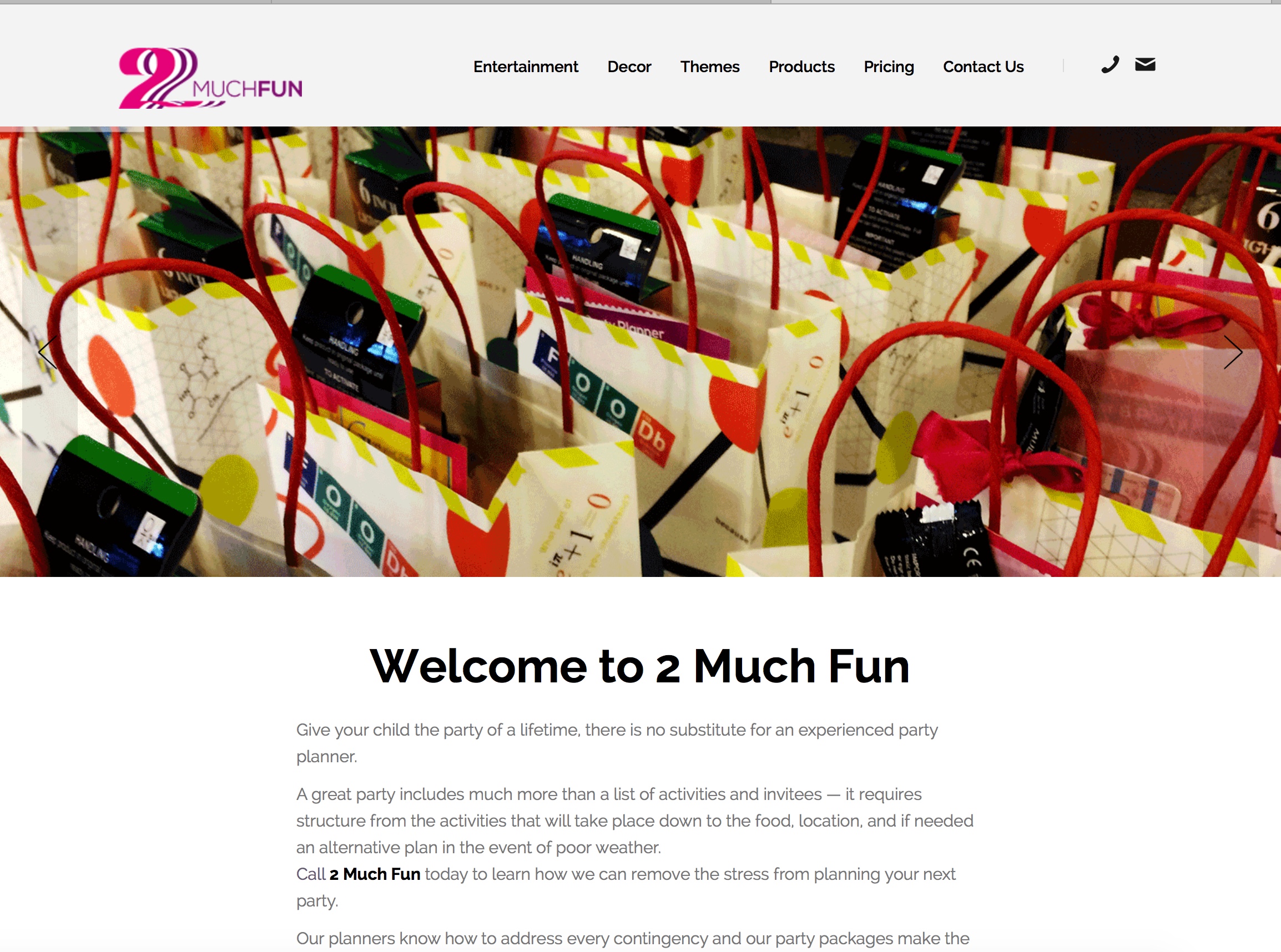
http://2muchfun.ch


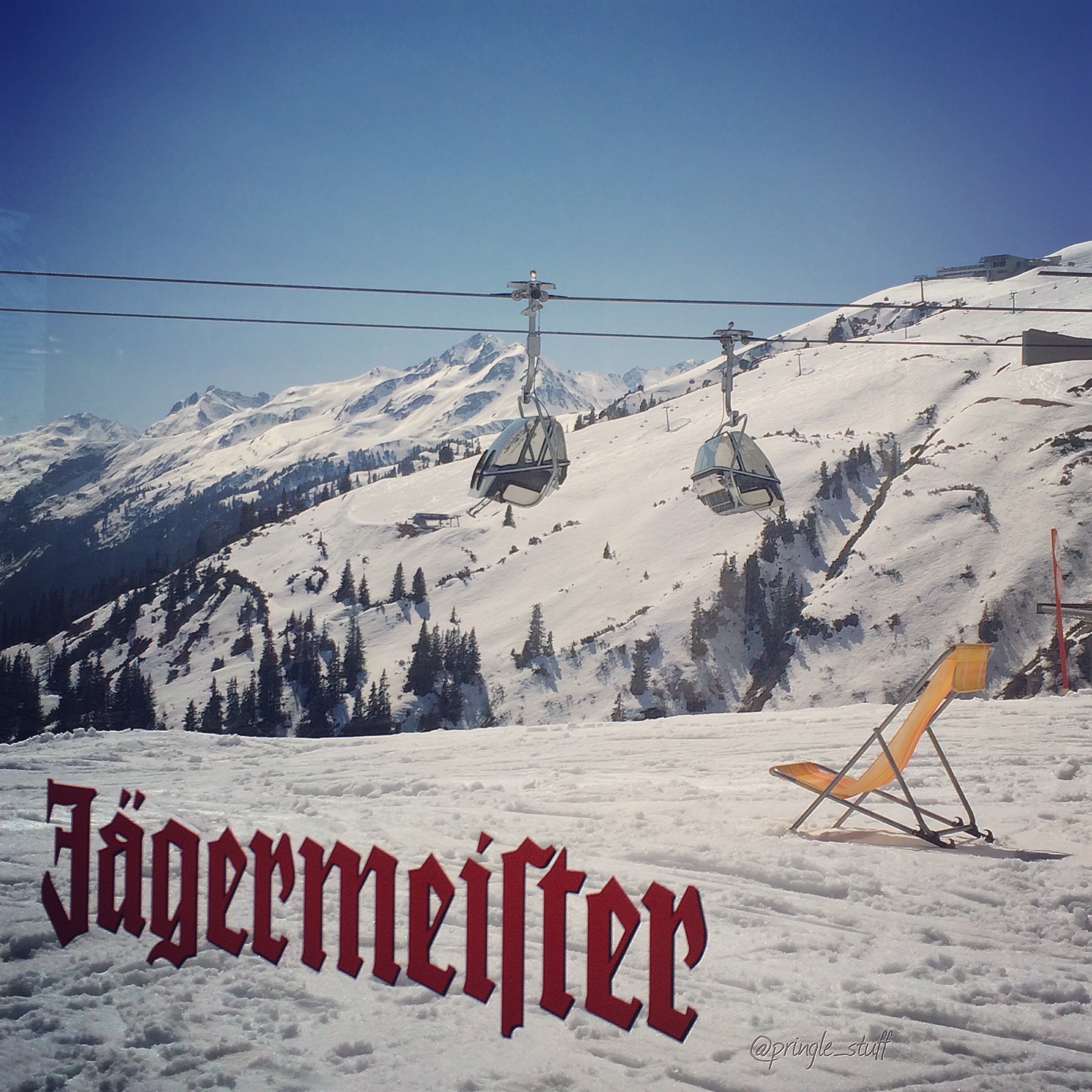
http://restauranthanegg.ch http://www.jaegermeister.at/de-at/home/

With the various businesses out there this will be an interesting challenge. One that I fully welcome and am prepared for. And to a degree, it is a taste of my old line of work where I had to wear several hats in order to deliver the best outcome for my clients and at the same time maintaining a good relationship for future work.

When a client, as in this particular one featured at the top of this blog – LivingSwitzerland, has been in their business for 20 years, then be sure to listen to their vision and needs. I’m enjoying this stream of work and watch this space for more to come.

If you would like a consultation on the revamp of your website images (to include look, style and colouring), please do not hesitate to contact me on the channels provided. Consultation from both Swiss and UK clients welcomed.
Recent Comments